
Earlier this week I threw in a roll of P30 in my X-700 to try out. I’ve been trying to get outdoors a bit more since it is Springtime and also trying to prepare for an upcoming hike. It seemed like a good time to try out some P30 with some more natural landscapes and also try to see how it behaves in Kodak XTOL. This time around, I rated it at 50 ISO instead of 80 and (but developed at 80). The results were a bit better than my last attempts, but I think I probably should have kept things at 50. Negatives look great to my eye but it does seem like I lost highlights in places. The results are still quite contrasty (though for these photos I dialied it up more as I wanted a contrasty look). It’s, I dunno sometimes an odd look from the film compared to, say, HP5. I’m not sure if it’s because of the lower red sensitivity or what. And on that note, some of these shots are of things that are indeed red (e.g. the bird feeder – my usual test shot of sorts, and the bricks which are reddish in color) but which appeared to come out a bit more like I would expect. The last time I shot P30 (at 80 and developed in ID-11), I definitely noticed lower red sensitivity. So not sure what to make of that. Anyways to the photos!
[envira-gallery id=”2285″]
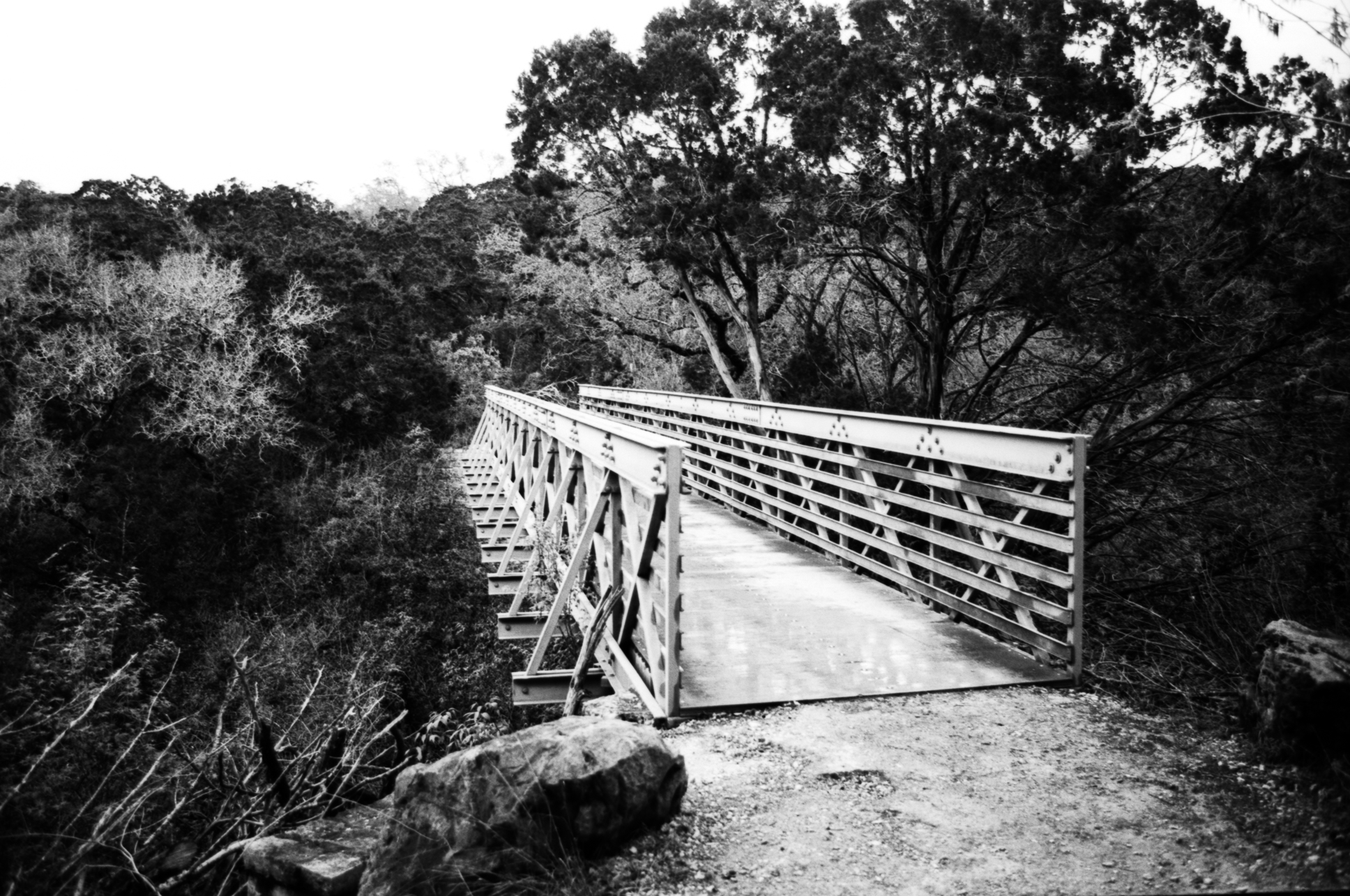
Overall, I still very much like P30 and find I much prefer it in XTOL over ID-11, at least when comparing with my admittedly small sample-size. I’m just trying to figure out when and how to use it. The grain is crazy small but it does have it’s own mood (for reasons I can’t quite articulate yet) over, say, PANF or FP4 that I’m not quite sure when to apply. I did kinda hope the nature scenes came out a bit better, though I can’t really say why as much. The leaves around the bench don’t have the tonal gradients I was hoping for (perhaps a function of shooting it at 50 instead of 80 and blowing out the highlights). But at the same time, I really liked the metal bridge. I’ve got one more roll though will likely be buying more of the stuff to continue to try out. And likewise I need to darkroom print some of these photos rather than scan them to draw some further conclusions. I would say that it does indeed appear to be a film that works best when exposed perhaps more carefully than other stocks.
I wish I could better explain the results but either way I think the pictures at least provide some further context on that fairly distinct look. I definitely applaud Ferrania’s efforts and am happy to see P30 is readily available. I plan to have a few rolls around to play with (and am looking forward to seeing what the 120 format looks like). I do hope they continue to work on it, or perhaps other black and white emulsions (in addition to their color plans). That (lack of) grain in particular is very impressive, though having that grain with something that is perhaps more natural would certainly be something.